Template configuration with template.yml
Global configuration
template.yml is the main template configuration file. The top-level properties are:
sdk_versionWhich major version of the Flourish SDK the template is compatible with. Currently this should be3.idA unique identifier for your template. If you publish a template and theidis already in use by you, the Flourish server will assume you are updating an existing template and overwrite it.versionA semantic version number identifying this version of your template.nameWhat the template will be called within Flourish.authorWho wrote the template.descriptionA short description of the template.creditsOptional credits for data sources, map tiles, etc, in Markdown format.image_downloadFlag to indicate whether an image snapshot can be generated. Defaults totrue.
If your template is packaged as a Node module, then the id, version, author and description fields may be omitted. If one of these properties is omitted then its value will be taken from the package.json file in the same directory. The id is taken from the name field of package.json; the other three are taken from the field of the same name.
The version number is explained in more detail in the template versioning reference.
Other properties are settings, build, and data, which are described below.
settings
The template.yml file will usually also include a settings section which populates the settings panel in the Flourish visualization editor (and SDK). Each setting allows the user to change a specific property in the template state. When a setting is changed by the user , state is updated and the template's update() function is called.
To improve the layout of your settings, you can set the width of any setting to be half or quarter of the width of the settings panel. You can also add a horizontal separator above a setting using new_section: true.
- property: my_number
  name: Near little number input
  width: quarter # Optional; sets the width of the setting
  new_section: true # Optional; starts a new line with the current setting and adds a line above
Settings properties
If an entry in the settings array is a string, it is interpreted as a section title. Otherwise it must be an object with the property and type properties. Other properties (see below) are optional, but name and description are recommended to help the user understand the role of the setting.
settings:
- Section title # Headings can be used to break up the settings into collapsible sections
- property: my_state_property # Required; must be a property of the [state object](template-js#state)
  name: Example number setting # Optional; appears next to the setting
  description: A setting for changing a number # Optional; appears on mouseover
  type: number # Required; see available types below
A setting can have the following properties
| Property | Required/Optional | Description |
|---|---|---|
property | Required | Must be a property of the state object |
type | Required | See available types below |
name | Optional | Appears next to the setting |
description | Optional | Appears on mouseover |
min | Optional | Only applicable when type is set to "number". Sets the minimum valid value. |
max | Optional | Only applicable when type is set to "number" Sets the maximum valid value. |
step | Optional | Only applicable when type is set to "number" Sets the step of the value input. |
width | Optional | Sets the width of the setting. Choose between full, half, quarter and three quarters |
new_section | Optional | Can be set to true or a string. Adds a line and title above the setting. |
optional | Optional | Only applicable when type is set to "number" or "color". Makes it possible to blank the setting. |
show_if | Optional | Show a setting on certain condition. See conditional settings. |
hide_if | Optional | Hide a setting on certain condition. See conditional settings. |
choices | Optional | Only applicable when type is set to "string". Adds dropdown with multiple choice functionality. See example. For icon/image buttons see below. |
choices_other | Optional | Same as choices, but the user can type a freeform value too |
style | Optional | Only applicable in combination with choices. Can be set to buttons which will turn dropdown into button group. |
Settings types
The following types of settings are supported:
| Type | Description |
|---|---|
boolean | Creates a checkbox that sets the state property to true or false. |
color | Creates a color picker that sets the state property to a string containing a hex RGB color e.g. "#123456". |
colors | Creates a color palette menu that sets the state property to an array of strings, each containing a color value, e.g. "#ff33c0". The menu contains the Flourish standard palettes plus any additional ones associated with the user's company. The user can edit the selected palette to add/remove/change colors. |
number | Creates a number input that sets the state property to a number. Optionally add min and max properties to limit the range step to control the input’s increment buttons. By default number settings always return a number and blanked inputs are set to zero; to allow blanked input, with null returned as the value, add optional: true. |
string | By default, creates a single-line text input that sets the state property to the relevant string text. |
text | Creates a user-resizeable multiline text input. Defaults to two lines tall. Can be made taller by adding size: large, which sets the height to half of the viewport height. |
code | Same as text but with a monospace font and text-wrapping control. |
font | Creates a font picker that sets the state property to the URL of a CSS stylesheet that will specify font imports. By default these are Google fonts, with URLs like https://fonts.googleapis.com/css?family=Montserrat. The value passed to the template state will be an object specifying both the font name and URL, for example: body_font: { name: "Mali", url: "https://fonts.googleapis.com/css?family=Mali" }. |
url | Creates a single-line text input with an upload button next to it. The file will be uploaded to a Flourish server and the field will be populated with the url of the uploaded file. |
Adding multiple choice dropdowns with choices and choices_other
For a series of specified options, use choices with type string, optionally adding choices_other set to true to include a freeform value option:
- property: my_state_property
  name: Example multiple choice setting
  type: string
  choices_other: true # This is optional and adds a freeform value option to the dropdown
  choices:
    - [ Option 1, option_1 ] # The first item is the display value of dropdown, second argument is the value that will be stored
    - [ Option 2, option_2 ]
    - [ Option 3, option_3 ]
For boolean choices, set the type to boolean and provide only true and false options:
- property: my_state_property
  name: Example multiple choice setting
  type: boolean
  choices:
    - [ Option 1, true ]
    - [ Option 2, false ]
Using icons and images as settings
When settings would be better indicated visually, you can use icons or images instead of settings names.
For these types of settings there are two options:
- Font Awesome icons (see left below)
- images as data URLs (see right below)
For icons, replace the option name in choices with the Font Awesome class name for the icon, like this:
  - property: alignment
    name: Alignment
    type: string
    style: buttons
    width: half
    choices:
      - [ fa-align-left, left ]
      - [ fa-align-center, center ]
      - [ fa-align-right, right ]
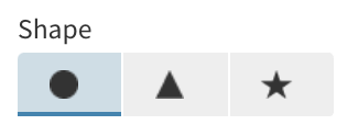
For images, use a base64 URL of your images (try using an encoder like this) and a structure like this:
- property: shape
    name: Shape
    type: string
    style: buttons
    width: half
    choices:
      -
        - data:image/png;base64,iVBORw0KGgoAAAANSUhEUgAAABAAAAAQCAYAAAAf8/9hAAAACXBIWXMAAAsTAAALEwEAmpwYAAAAAXNSR0IArs4c6QAAAARnQU1BAACxjwv8YQUAAAENSURBVHgBpZM/boMwFMafbRi6tRMSEzeoR0ZyguQIPUJvELhBc4t2S26QkQEJ9wRlQowVLJH4l88JiUiGCJyfZGRjf8/v2f4Y3SGlDIQQq77vl4wxb/itdLNtO4rjOBuvZ5dOEASvZVmuIfqkB2D+q2maSCn1fw2gxVVV7dF9p2motm0XOgjXI73zDLFGWpa1PmXg+75X1/UfGYByFhzikAzpum7FEWVO6vcZLDmuS5I5Hqcn0QEyMgQlKF3CjgyBVnGwJUPwmCKR53nmuu4bxj7NY5Om6TcfIoV0NsxUfgcNCf0piuLgOM4PynmZkMkG4o8bM42BnT3YOaSzN05vBIeV4cR3aNskSfbj9UeWKWms44WNhgAAAABJRU5ErkJggg==
        - circle
      -
        - data:image/png;base64,iVBORw0KGgoAAAANSUhEUgAAABAAAAAQCAYAAAAf8/9hAAAACXBIWXMAAAsTAAALEwEAmpwYAAAAAXNSR0IArs4c6QAAAARnQU1BAACxjwv8YQUAAACWSURBVHgBnY7RDYUgDEXb4iBvBD744JO3gRvpaAzADu4BH4gmJobQar0JoYEL5wAIsdYG51yQOpN0aYxZaq3HGLkOgUBv27kkC5Lo19wsFtUHN/oV1oKe6E8W2B9473+llG1YRvynlKJo0B6vwGRkgW/pnAW9pXMWqKGPLEhDH1mglt5bkJbeW+AX+t1iyjnPbYjwLWEHTYZXQItJaAsAAAAASUVORK5CYII=
        - triangle
      -
        - data:image/png;base64,iVBORw0KGgoAAAANSUhEUgAAABYAAAATCAYAAACUef2IAAAACXBIWXMAAAsTAAALEwEAmpwYAAAAAXNSR0IArs4c6QAAAARnQU1BAACxjwv8YQUAAAFISURBVHgBlVPLbYNAEJ2FBsiJK+mA8Dnk5E0FcQchHdgVxKnATgnpIOnABYDYErhxtcQZlDeKkVZo14yfNGJ3ZngMb2aIhCjLMi2KQkvzA2niOI7VNE1ami8mVkq9wt6k+SJilgGPhE0qh4iYZZjPUjlExCyDdRbJsUqcpqmmfxlmiORQWutoGIbj4mUbiSPWXc2FDtLt1bWqKAzDE47irnvwBdKDMeaibG+WZRU0/CB/9T5cYO9N0/zMjtCO9n1v4jj+DYLgAdeUZDijyue2bY3tVL5sVL9D9Ue6AcT3dV2fXDHvVGBeDa3Dm+MlRjMrWgE+vr2bGNgs7h0tRuzWsjiJHUvBY/SErj+C7NPyR75lcRJbMnQgegHhjmeTHWjWgX1z9T45fFJs5ipBdF4G2YcYk3+zHLxgtAb+tTzPtyQELxWIk6X/D9xqc6YQvNASAAAAAElFTkSuQmCC
        - star
Loading custom fonts with type: font setting
After adding a font setting to your template. The template can load the font by inserting a link tag into the document, like this:
  var font_link = document.createElement("link");
  font_link.setAttribute("rel", "stylesheet");
  document.body.appendChild(font_link);
  // Assuming the setting property is named "body_font"
  font_link.setAttribute("href", state.body_font.url);
Then elements can be styled by referencing the font name, whether in attributes or in CSS. If the font is being inherited in CSS, you could just add it to the document body, like this:
document.body.style.fontFamily = state.body_font.url;
Conditional settings
Sometimes you might want to simplify the user experience for Flourish users by hiding some settings depending on whether they are needed or not. You can use the show_if and hide_if properties to control whether or not a setting should be displayed based on another setting’s value.
In the following example, the X axis label setting will only be displayed if “Show X axis” is selected:
- property: show_x_f
  name: Show X axis
  type: boolean

- property: x_axis_label
  name: X axis label
  type: string
  show_if:
    show_x_axis: true
You can use the following shorthand syntax for booleans. This is equivalent to the previous example:
show_if: show_x_axis
If you specify an array of conditional values, this setting will be displayed if the referenced setting has any of the specified values. In the following example, the setting is displayed if color_mode is set to either "diverging" or "continuous":
show_if:
  color_mode: [diverging, continuous]
The hide_if option works in exactly the same way, except that the setting is hidden if the conditional test passes.
hide_if:
  color_mode: diverging
You can also control how settings display depending on whether or not particular data bindings have been specified. A binding is specified using the syntax data.[dataset].[key]. For example:
show_if: data.values.filter1 // shorthand syntax

show_if:
  data.values.filter1: true
You cannot specify both show_if and hide_if options on the same setting.
Multiple conditions
You can specify multiple conditions. How you specify them will determine if they operate as AND or OR conditions.
Where all conditions should pass for the setting to be displayed, use an object syntax. For example, the setting below will be shown if show_x_axis is enabled AND color_mode is set to "diverging".
show_if:
  show_x_axis: true
  color_mode: diverging
The above is therefore equivalent to:
show_x_axis === true && color_mode === "diverging"
Where only one combination of conditions should pass for the setting to be displayed, use an array syntax where conditions within an array (elements separated with -) operate as OR and conditions within an object still operate as AND.
For example, the setting below will be shown if chart_mode is "line", OR if chart_mode is "bar" AND the "labels" data binding contains numeric data.
show_if:
  - chart_mode: line
  - chart_mode: bar
    data.data.labels.type: numeric
In other words, the example above is equivalent to:
(chart_mode === "line") || (chart_mode === "bar" && data.data.labels.type === "numeric")
build
The template.yml file will usually also include a build section defining build rules.
It defines the build processes used to build your template from source. You can have any number of build processes, and changes to the relevant files will trigger the appropriate build.
The following example defines build scripts for JavaScript and CSS:
build:
  src:
    script: npm run build
    directory: src
    files:
      - rollup.config.js

  less:
    script: npm run less
    directory: less
Each build rule defines a script, and a directory and/or an array of files. If any file in the specified directory, or any file named in the array, changes while the SDK is running then the appropriate build script is executed. The flourish build command can be used to test build rules.
data:
The template.yml file may also include a data section. This section consists of an array of data bindings that sets how the template should use and refer to the template’s editable data tables (which are initially populated by the CSV files in data/).
Each binding adds one or more columns of data to a dataset under a particular key. You can define as many datasets as you like. They are made available to the template as properties of the data object.
Once your template is published, Flourish users can change the data in the Flourish editor, and also change which columns are assigned to each binding. But in your code you don’t need to worry about this because you just refer to the key rather than referencing the column header or index.
There are two types of data binding: column is used when the number of columns is and must always be one; columns supports any number of columns, including none.
A default value must be supplied for each data binding, unless you have specified optional: true (only supported for single column bindings). The example below shows how this is done.
Example data configuration
The following example sets up a dataset with two keys, one single-column and one multi-column.
data:
- Locations # Optional title; breaks up the bindings into collapsible sections
- Setting block description # Optional description for this section, shown in the UI
- name: Country name # Name shown in UI
  description: Name of country # Optional description for the UI
  dataset: countries # Which dataset this binding is part of
  key: country_name # The key used to access the data in this binding in the template code
  type: column # This binding can take only one column
  column: Countries::A  # The default values are drawn from column A of `Countries.csv`
- name: Values
  dataset: countries
  key: values
  type: columns # This binding can take any number of columns
  columns: Countries::B-D,F # The default values are arrays drawing from columns B-D and F of `Countries.csv`
- name: Flag image
  dataset: countries
  key: country_flag
  type: column
  optional: true # Default values can be omitted for an optional binding
In this example, if Countries.csv contained the following…
Country,1970s,1980s,1990s,20th_century_mean,2000s
US,3122,3128,3129,984,3119
GB,1203,1205,1208,1121,1200
FR,1030,1005,1010,3076,1024
… then in your template data.countries would be:
[
  { country_name: "US", values: [ "3122", "3128", "3129", "3119" ]},
  { country_name: "GB", values: [ "1203", "1205", "1208", "1200" ]},
  { country_name: "FR", values: [ "1030", "1005", "1010", "1024" ]}
]
The column headers are available in any dataset via the column_names property of the data array. E.g. in the above example data.country_scores.column_names is:
{ country_name: "Country", values: [ "1980s", "1990s", "2000s", "2010s" ]}
It is possible to constrain the type of columns which may be assigned to a binding by the user:
data:
- Locations
- Binding description
- name: Country name
  description: Name of country
  dataset: countries
  key: country_name
  type: column
  column: Countries::A
  data_type:
    - string
The data_type property is an array with one or more of string, number, and datetime. In this example the country code must be a string. By default the value of this field is - string, so only string columns may be assigned when no data_type is specified.
Automatically assigning columns to bindings
Bindings may include configuration for automatic column assignment to allow template authors to customise its behavior. Since automatic column assignment is a large topic, it is documented in a separate page.